1. 前言
最近公司给了我一个任务是用vue重构一个很老的jsp项目,页面样式是定制的,不能用组件库,里面的轮播图那就得自己实现了。这里我用swiper实现
2. 效果
- 纯图片轮播的

- 展示多个轮播图片项的
图片和文字作为一个轮播项的
其他
甚至连医生的信息卡片也要轮播(此时截图是静态的)

还有这个…

还有好多轮播效果,样式交互全都不一样。
所以我们封装的组件最好要一次性满足以上所有效果,我这里选用swiperjs来实现
web Component组件: swiperjs官方文档
swiper vue组件我不太推荐,原因:
3. 实现步骤
1. 安装swiperjs
npm install swiper

pnpm install swiper
2. 注册使用
1. 全局注册
// main.ts
import { createApp } from 'vue'
import App from './App.vue'

const app = createApp(App)

// 注册swiper组件,引入样式文件
import 'swiper/element/bundle'
import { register } from 'swiper/element/bundle'
register()

app.mount('#app')
2. 基本使用示例
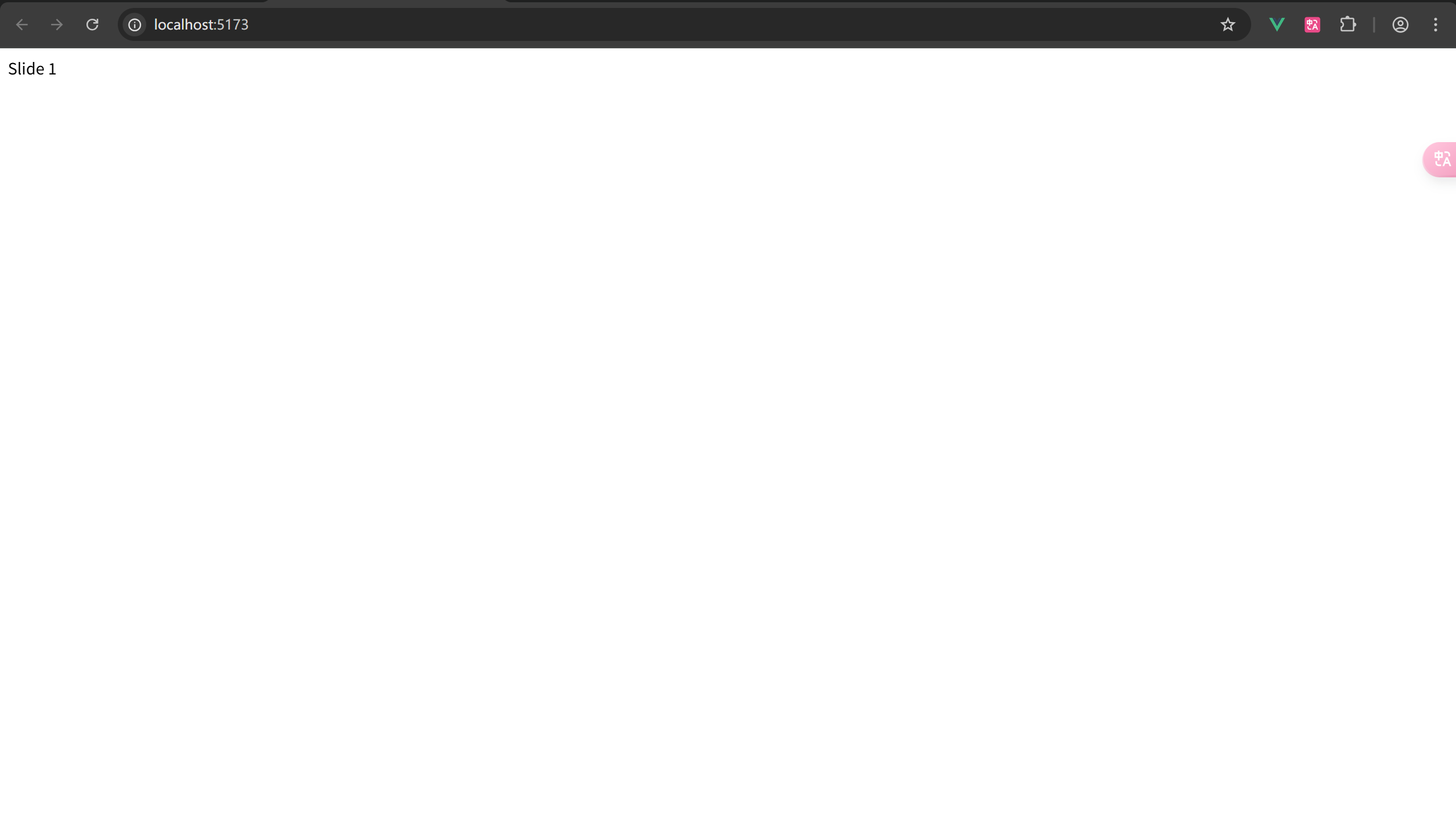
<template>
  <swiper-container>
    <swiper-slide>Slide 1</swiper-slide>
    <swiper-slide>Slide 2</swiper-slide>
    <swiper-slide>Slide 3</swiper-slide>
  </swiper-container>
</template>
按照官网上示例这样写此时我们发现页面上是这个样子的,什么都没有,不像个轮播图
我们需要在swiper-container标签上添加一些属性
slides-per-view - 每个swiper-container显示的slides数量
navigation - 左右切换按钮
pagination - 分页器
loop - 循环播放
更多属性方法看 swiperjs官方文档API
<template>
  <swiper-container
    slides-per-view="1"
    navigation="true"
    pagination="true"
    loop="true"
    style="width: 600px; height: 300px"
  >
    <swiper-slide style="background-color: #ff6666">Slide 1</swiper-slide>
    <swiper-slide style="background-color: #66ff66">Slide 2</swiper-slide>
    <swiper-slide style="background-color: #6666ff">Slide 3</swiper-slide>
  </swiper-container>
</template>
效果: 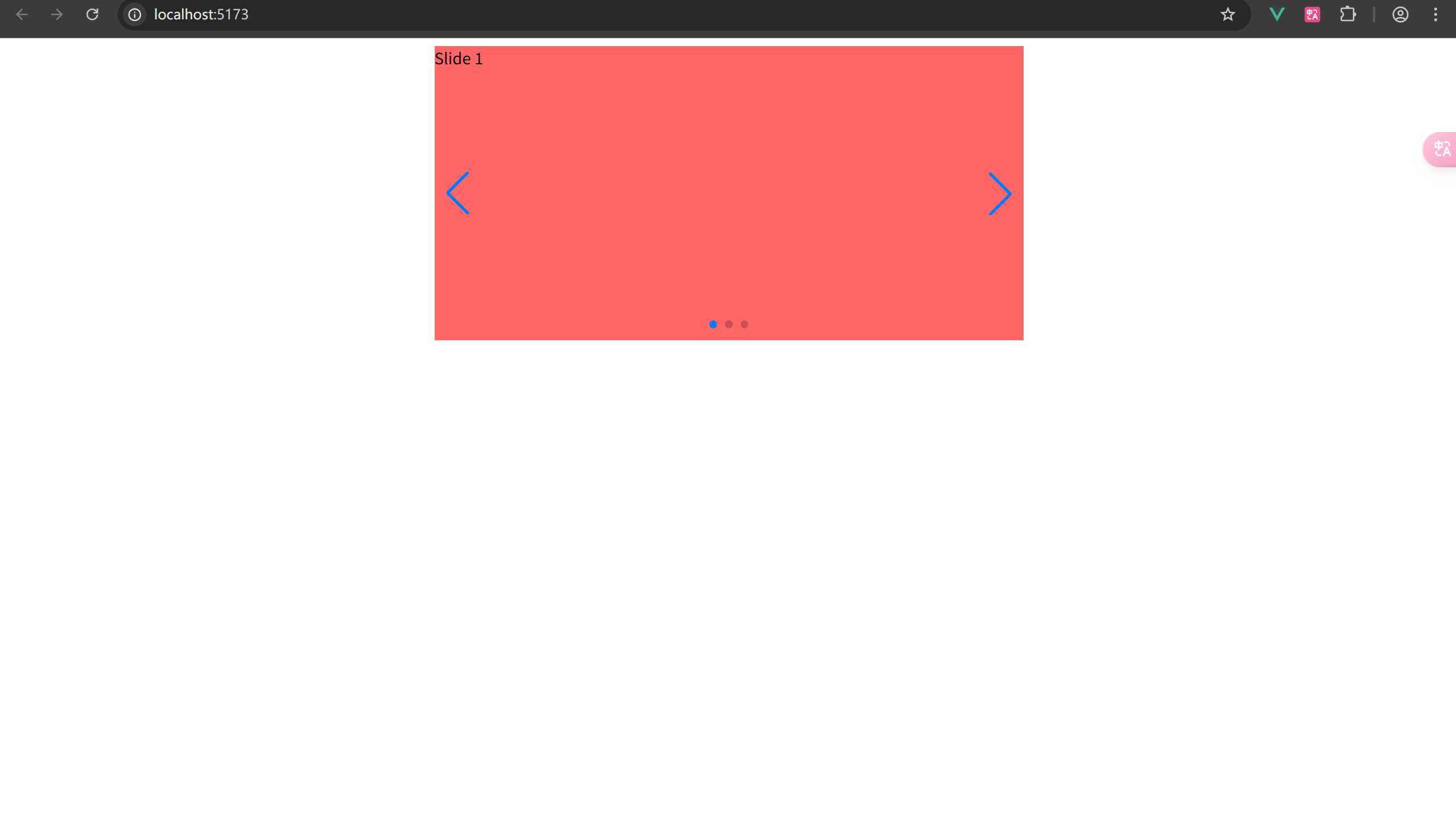
3. 警告问题解决
打开控制台我们发现两个警告
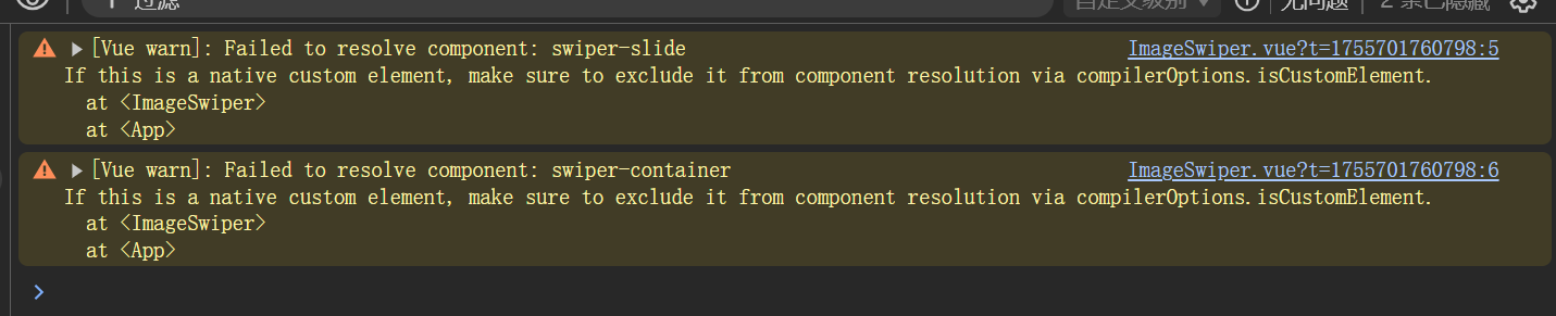
大致意思就是,vue不能解析这两个组件,因为前面说了,我们引入的是web component,要让vue识别也很简单我们只要这样做
// vite.config.js
export default defineConfig({
  plugins: [
    vue({
      template: {
        compilerOptions: {
          // 将所有以swiper-开头的标签名都视为自定义元素
          isCustomElement: tag => tag.startsWith('swiper-')
        }
      }
    }),
  ]
})不了解web component的可以先去看看下面这个链接
4. 实现循环自动轮播效果
首先要给swiper-container设定一个固定宽度或者给包裹它的div元素给一个固定宽度,高度由子元素高度撑开就可以了。这里我给swiper-container再包一层div,因为后面要放一个自定义的分页器,分页器最好不要放在swiper-container里面
给轮播项写点样式,最重要的是包裹他们的容器样式一定要加上 overflow: hidden
要实现自动轮播效果加上 autoplay-delay 设置一个数字,单位毫秒
循环播放加上 loop 属性
<script setup lang="ts">
import { ref } from 'vue'

const playInfos = ref([
  ...轮播数据源
])

</script>

<template>
  <div class="swiper-box">
    <swiper-container loop="true" autoplay-delay="2000">
      <swiper-slide v-for="item in playInfos" :key="item.href" class="box-item">
        <a class="img-a" :href="item.href" target="_blank">
          <img :src="item.img" :alt="item.title" />
        </a>
        <a class="title" :href="item.href" target="_blank">
          {{ item.title }}
        </a>
      </swiper-slide>
    </swiper-container>
  </div>
</template>

<style scoped lang="scss">
.swiper-box {
  position: relative;
  width: 293px;
  height: 265px;
  border: 3px #dad8d8 solid;
  overflow: hidden; // 这个很重要,一定要加上
  a {
    color: #333;
    display: block;
  }

  .box-item {
    display: flex;
    flex-direction: column;
    background: #fff;
    .img-a {
      height: 240px;
      img {
        width: 293px;
        height: 240px;
        overflow: hidden;
      }
    }
    .title {
      line-height: 25px;
      font-size: 14px;
      text-align: center;
      color: #000;
      font-weight: bold;
      background-color: #e8e8e8;
      // 文字溢出一行省略号
      white-space: nowrap;
      overflow: hidden;
      text-overflow: ellipsis;
    }
  }
}
</style>
这样一个基本的轮播效果就实现了
5. 自定义分页器
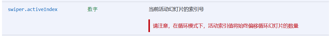
我们获取幻灯片索引的时候要用 realIndex,千万不要用 activeIndex,我当时就是搞了好久被这个区别坑害惨了
看官网对这两个属性的描述

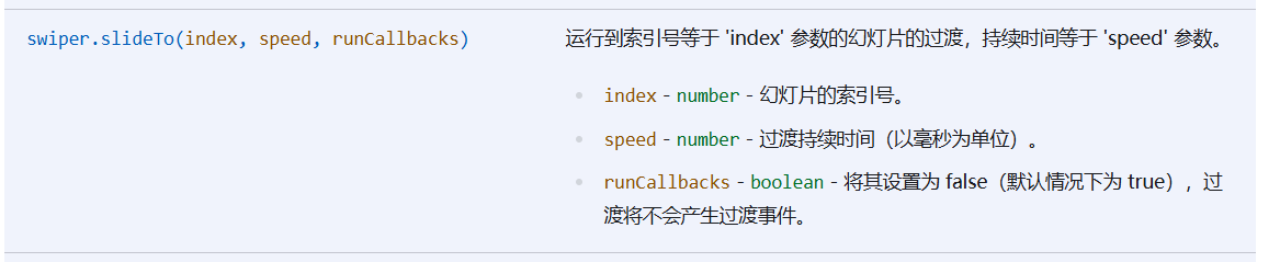
slideTo 方法描述
<script setup lang="ts">
// ...其它代码

const swiperRef = ref()
const currentIndex = ref(0)

const onSlideChange = e => {
  currentIndex.value = e.detail[0].realIndex
}

const goToSlide = (index: number) => {
  if (swiperRef.value && swiperRef.value.swiper) {
    swiperRef.value.swiper.slideTo(index)
  }
}

// ...其他代码
</script>

<template>
  <div class="swiper-box">
    <swiper-container
      ref="swiperRef"
      loop="true"
      autoplay-delay="2000"
      @swiperslidechange="onSlideChange"
    >
      <swiper-slide v-for="item in playInfos" :key="item.href" class="box-item">
        <a class="img-a" :href="item.href" target="_blank">
          <img :src="item.img" :alt="item.title" />
        </a>
        <a class="title" :href="item.href" target="_blank">
          {{ item.title }}
        </a>
      </swiper-slide>
    </swiper-container>
    <!-- 自定义分页器 -->
    <div class="pagination">
      <span
        class="dot"
        :class="{ active: currentIndex === index }"
        @click="goToSlide(index)"
        v-for="(item, index) in playInfos"
        :key="index"
      >
        {{ index + 1 }}
      </span>
    </div>
  </div>
</template>

<style scoped lang="scss">
// 分页器样式
.pagination {
  position: absolute;
  z-index: 10;
  right: 5px;
  bottom: 28px;
  line-height: 25px;
  .dot {
    border: 1px solid #999999;
    background: #121210;
    padding: 1px 5px;
    margin: 0 2px;
    font-style: normal;
    cursor: pointer;
    color: #ffffff;
  }
  .active {
    background: #cc0000;
    color: #ffffff;
  }
}
</style>
最终效果: 
6. 过度动效
swiper提供了很多过渡效果,比如slide、fade、cube、coverflow、flip等

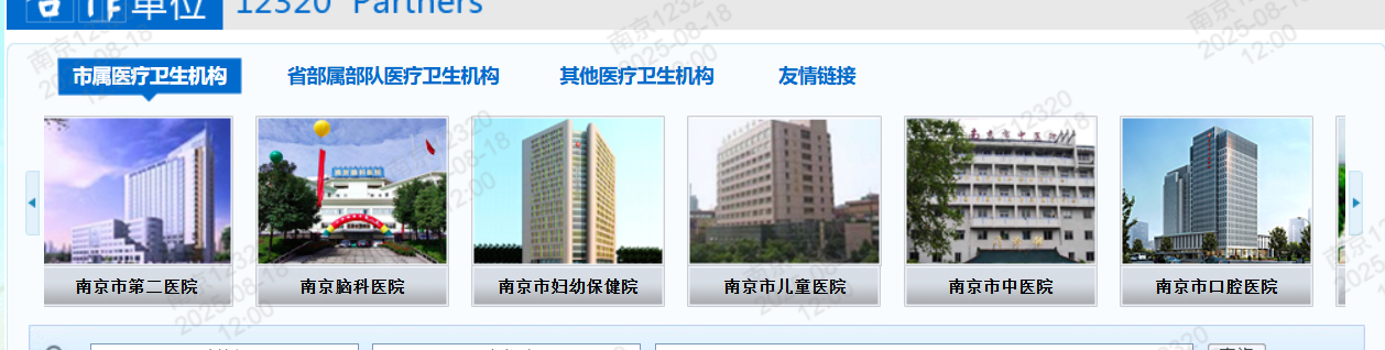
打开南京12320官网发现这个轮播组件的过度动效是渐变的,给 swiper-container 加上 effect="fade" 就可以了
7. 自定义箭头
像下面这个轮播组件是有自定义箭头的
实现自定义箭头就很简单了
重点是给 swiper-container 加上 navigation 属性给定 nextEl 和 prevEl 的值分别为 .swiper-button-next 和 .swiper-button-prev
你给出的自定义箭头html的类名要加上 .swiper-button-next 和 .swiper-button-prev ,其他的调整一下样式就好了
代码如下:
<script setup lang="ts">
import { ref } from 'vue'

const images = ref(...数据信息)
</script>

<template>
  <div class="swiper-box">
    <swiper-container
      loop="true"
      autoplay-delay="2000"
      pagination="true"
      :navigation="{
        nextEl: '.swiper-button-next',
        prevEl: '.swiper-button-prev'
      }"
    >
      <swiper-slide v-for="value in images" :key="value" class="box-item">
        <img class="swiper-slide" :src="value" />
      </swiper-slide>
    </swiper-container>
    <div class="swiper-button-prev prev arrow"></div>
    <div class="swiper-button-next next arrow"></div>
  </div>
</template>

<style scoped lang="scss">
.swiper-box {
  position: relative;
  width: 262px;
  height: 242px;
  border: 3px #dad8d8 solid;
  overflow: hidden;
  .arrow {
    width: 30px;
    height: 31px;
    margin: -20px 0 0;
    display: block;
    background: url(@/assets/images/ad_ctr.png) no-repeat;
    position: absolute;
    top: 50%;
    z-index: 10;
    cursor: pointer;
  }
  .prev {
    left: 10px;
  }
  .next {
    right: 10px;
    background-position: 0 -33px;
  }
  .box_left_bottom {
    box-sizing: border-box;
    margin-top: 10px;
    text-align: center;
    width: 262px;
    height: 242px;
    padding: 10px;
    background-color: #f7f7f7;
    border: 1px #e0e0e0 solid;
    img {
      width: 262px;
      height: 242px;
      object-fit: cover;
    }
  }
}
</style>
效果:
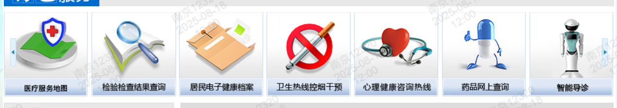
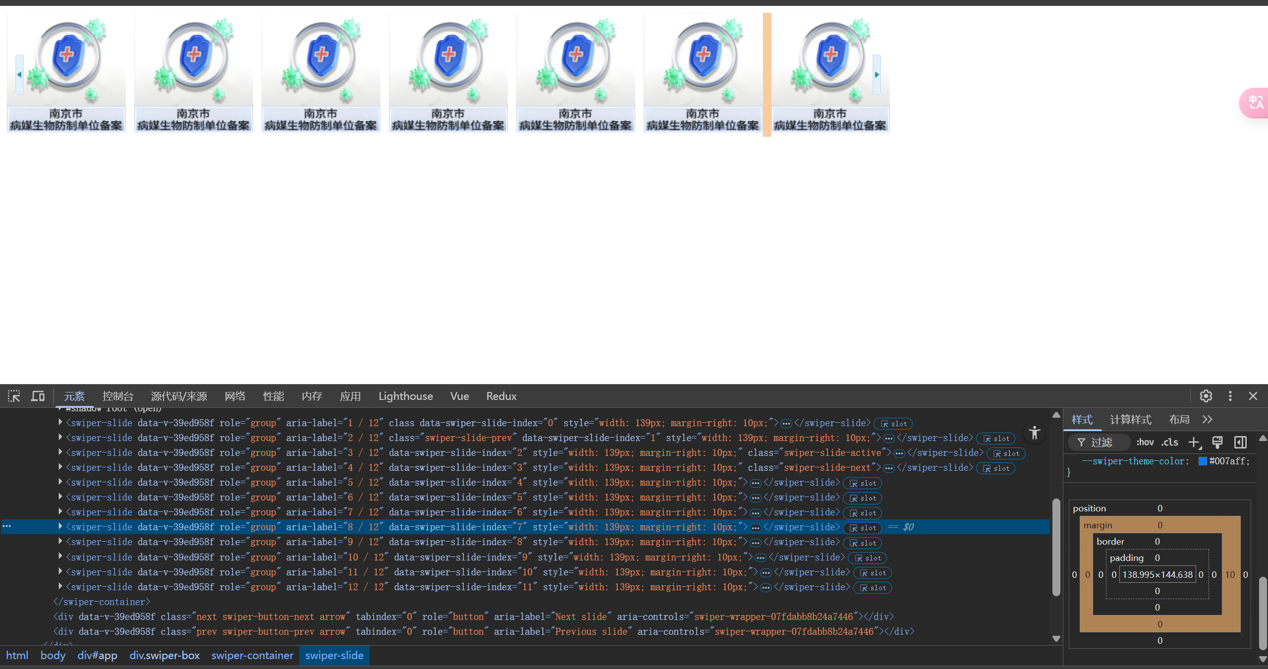
8. 展示多个轮播项
展示多个轮播项的话只要给 swiper-container 设置 slides=per-view 属性即可
但有一点要注意的是,盒子的总宽度要给一个合适的值,宽度 = (轮播项宽度 + space-between值)* slides-per-view - space-between值 这样计算出来的值就很合适了
比如这个轮播组件,要展示7个轮播项,我只给宽度设置 900px 这些轮播项会挤压在一起,哪怕设置了 space-between 也没有间隔效果
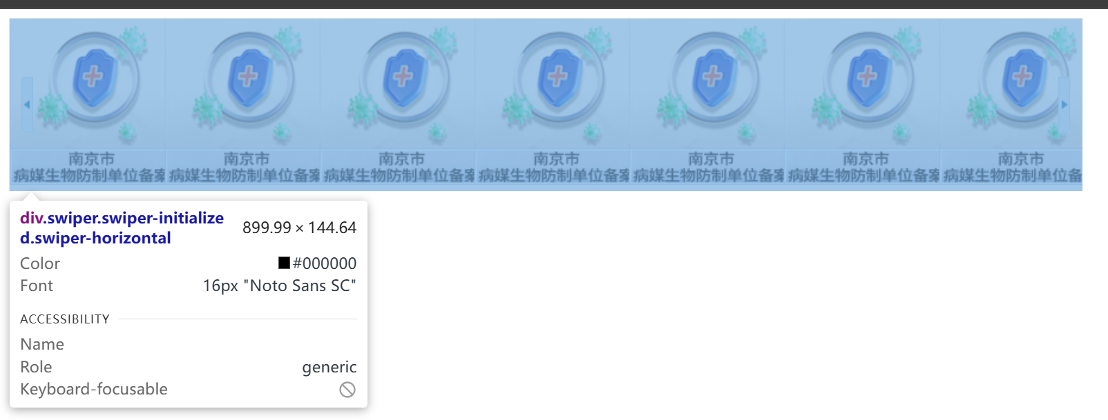
这个图片宽度是 139px 要给的轮播项间距 space-between 是 10,展示 7 个 ,那么合适的总宽度为 (139 + 10) * 7 - 10 = 1033
看效果
代码实现:
<template>
  <div class="swiper-box">
    <swiper-container
      space-between="10"
      slides-per-view="7"
      loop="true"
      :navigation="{
        nextEl: '.swiper-button-next',
        prevEl: '.swiper-button-prev'
      }"
    >
      <swiper-slide v-for="item in 12" :key="item">
        <img src="./index_40.png" />
      </swiper-slide>
    </swiper-container>
    <div class="next swiper-button-next arrow"></div>
    <div class="prev swiper-button-prev arrow"></div>
  </div>
</template>

<style lang="scss" scoped>
.swiper-box {
  position: relative;
  width: 1033px;
  .arrow {
    position: absolute;
    top: 50%;
    transform: translateY(-50%);
  }
  .next,
  .prev {
    width: 10px;
    height: 47px;
    z-index: 10;
    cursor: pointer;
  }

  .prev {
    background-image: url(./index_scrollpic_left.jpg);
    left: 10px;
    right: auto;
  }

  .next {
    background-image: url(./index_scrollpic_right.jpg);
    right: 10px;
    left: auto;
  }
}
</style>
4. 踩坑总结
初次使用swiperjs比较生疏,好多参数都弄不懂,打开官方文档一看,密密麻麻的属性方法。甚至一开始我看的还不是v11.x的文档,折腾我半天
在做导航箭头的时候,我一开始是把他们 swiper-container 里面和 swiper-slide 同级,结果不行,因为每次切换下/上一项的时候,箭头导航会随着轮播滚动,而不是固定在原地,而且还要给自定义的导航箭头盒子设置 .swiper-button-prev/next 让swiper识别
在做自定义分页器的时候,要获取当前幻灯片的索引实现当前分页器高亮,我看别人的文章使用的 activeIndex ,我也这样做,踩坑了,仔细翻了文档才明白,由于我设置了 loop 为 true 开启了循环模式,所以最好是用 realIndex
5. 组件封装
我觉得还可以给swiper组件二次封装,因为我这个使用场景全都是要用自定义的导航箭头和分页器,每次还要给swiper外面再包一层 div,导航箭头的摆放位置也差不多,不用给每个都设置位置摆放样式,而且swiper容器的宽度最好也是根据子容器个数和子容器间隔宽度来动态计算,不然每次给固定宽度很麻烦,嗯我下次有空的时候封装一下后面这篇文章继续更新。
其实我在用swiper的web component组件之前就是用 new Swiper的方法来封装的,因为我那时刚看官方文档没发现这个有vue的用法… 我先贴代码
<script setup lang="ts">
import { onMounted, onUnmounted, PropType, ref } from 'vue'
import Swiper from 'swiper'
import 'swiper/css'
import 'swiper/css/effect-fade'
const swiperRef = ref<Swiper | null>(null)
const containerRef = ref<HTMLElement | null>(null)
const props = defineProps({
// 整个轮播的宽度
width: {
type: String,
default: '100%'
},
// 展示左右箭头方式
showArrows: {
type: String as PropType<'always' | 'hover' | 'never'>,
default: 'always'
},
// 同时可见的轮播数量
showCount: {
type: Number,
default: 1
},
// 相邻轮播之间的间距,单位px
spaceBetween: {
type: Number,
default: 0
},
// 左箭头和右箭头距离最左/右的间隔
arrowGap: {
type: Number,
default: 0
},
// 循环播放
loop: {
type: Boolean,
default: true
},
// 动效
effect: {
type: String as PropType<
'slide' | 'fade' | 'cube' | 'coverflow' | 'flip' | 'creative' | 'cards'
>,
default: 'slide'
},
// 是否开启自动播放
autoPlay: {
type: Boolean,
default: false
},
// 自动播放间隔时间,单位ms
autoPlayDelay: {
type: Number,
default: 4000
},
// 是否显示指示器
showPagination: {
type: Boolean,
default: false
},
// 是否竖向轮播
vertical: {
type: Boolean,
default: false
}
})
const emit = defineEmits(['change'])
onMounted(() => {
if (containerRef.value) {
const nextBtn = containerRef.value.querySelector(
'.swiper-button-next'
) as HTMLElement
const prevBtn = containerRef.value.querySelector(
'.swiper-button-prev'
) as HTMLElement
swiperRef.value = new Swiper(containerRef.value, {
direction: props.vertical ? 'vertical' : 'horizontal',
slidesPerView: props.showCount,
spaceBetween: props.spaceBetween,
navigation: {
nextEl: nextBtn,
prevEl: prevBtn
},
...(props.showPagination && {
pagination: {
el: '.swiper-pagination',
clickable: true, // 允许点击指示器切换
bulletClass: 'swiper-pagination-bullet',
bulletActiveClass: 'swiper-pagination-bullet-active'
}
}),
loop: props.loop,
effect: props.effect,
...(props.autoPlay && {
autoplay: {
delay: props.autoPlayDelay
}
})
})
swiperRef.value.on('slideChange', function (swiper) {
emit('change', swiper)
})
}
})
onUnmounted(() => {
if (swiperRef.value) {
swiperRef.value.destroy()
swiperRef.value = null
}
})
defineExpose({
swiper: swiperRef
})
</script>
<template>
<div
class="swiper-container"
ref="containerRef"
:style="{ width: props.width }"
>
<div class="swiper-wrapper">
<slot></slot>
</div>
<template v-if="showArrows === 'always' || showArrows === 'hover'">
<div
:class="['swiper-button-next', { 'show-type': showArrows === 'hover' }]"
:style="{ right: props.arrowGap + 'px' }"
>
<slot name="next"> > </slot>
</div>
<div
:class="['swiper-button-prev', { 'show-type': showArrows === 'hover' }]"
:style="{ left: props.arrowGap + 'px' }"
>
<slot name="prev"> < </slot>
</div>
</template>
<div class="swiper-pagination"></div>
</div>
</template>
<style scoped lang="scss">
.swiper-container {
position: relative;
height: 100%;
min-height: 75px;
overflow: hidden;
.show-type {
opacity: 0;
transition: opacity 0.3s ease;
&:hover {
opacity: 0.8;
}
}
.swiper-button-next {
position: absolute;
top: 50%;
right: 0;
z-index: 10;
cursor: pointer;
transform: translateY(-50%);
}
.swiper-button-prev {
position: absolute;
top: 50%;
left: 0;
z-index: 10;
cursor: pointer;
transform: translateY(-50%);
}
.swiper-pagination {
width: 100px;
height: 20px;
position: absolute;
bottom: 10px;
left: 50%;
transform: translateX(-50%);
z-index: 10;
cursor: pointer;
:deep(.swiper-pagination-bullet) {
display: inline-block;
width: 8px;
height: 8px;
border-radius: 50%;
background: rgba(186, 186, 186, 0.5);
margin: 0 4px;
cursor: pointer;
transition: all 0.3s ease;
&:hover {
background: rgba(255, 255, 255, 0.8);
}
}
// 激活状态指示器样式
:deep(.swiper-pagination-bullet-active) {
background: #87b9ff;
}
}
}
</style>eee后面有空我再基于swiper-container封装一个吧
哇为了写这篇文章再写一遍这个代码感觉更熟练使用swiper了

